Monday, November 7, 2011

Fall Paper Fun


For these two seasonal cards, I pulled out some retired fall design paper from SU called Autumn Meadows. For the first card I used an older sketch from Viva la Verve (Jan 2011) because I love the way it showcases the design paper and because its so quick and easy to follow. For the second card, combined inspiration from two different sources. I was inspired by my SU demo, Krista Fenton to use a second layer of the same color cardstock as my base but then ink the edges to create a border. A cute card I found in Stamp It Techniques (on page 46 by Ashley Harris) was my other source. She paper peiced a pumpkin using cute paper and used a clean and simple style by adding only a sentiment underneath in order to let the pumpkin stand out. I'm not used to leaving so much white space on a card but I like the effect.
Enjoy what remains of the fall!!

Tuesday, October 25, 2011

Classic Fall Leaf


Since it is the height of fall, I thought it only proper to share this classic fall card with you. This is my favorite use of versamark and chalk; it makes it so easy to create a blend of colors on the leaf so it looks realistic. I sponged the edge of the oval focal point in order to continue the soft look. For the background, i simply randomly stamped the acorn stamp using versamark ink. The images used for this card are from a retired Stampin' Up! set called Country Blessings, and my sentiment is from SU's Sincere Salutations.
Enjoy your fall!

Wednesday, October 12, 2011

Spool of Thread


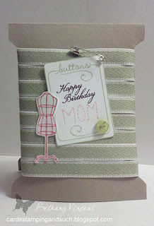
This trendy card I made for my seamstress Mom for her birthday last week. I cased a fabulous card called "On the Mend" by Ryann Salamon that I found on page 83 of Stamp It cards, a special issue put out by Paper Crafts magazine. The card base isn't hard to create, but I never would have thought of this on my own. That's why I love the special issues, there's always so much inspiration. The images on the card come from SU's Sew Suite set, and the "thread" is pear pizazz ribbon.

Thanks for stopping by :0)

Saturday, October 1, 2011

Pumpkin Coffee


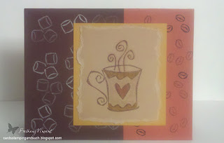
Pumpkin coffee has returned!! And I’ve been drinking my fair share lately :o) So along those lines, I have some retro cards to share with you that were created with a favorite SU set that has been around for a long time called “Espress Yourself.” The colors of my first card all come from the classic earth elements color family – chocolate chip, really rust, more mustard, and creamy caramel. To color in my mug, I used a versamark marker on the base so that it would be just a little darker than the cardstock and then used more mustard and really rust for the border and heart. My final step was to cover the heart with crystal effects making it smooth and shiny.


For the second card I used a classic pink and brown color combo and a fairly basic design of alternating panels in creamy caramel and close to cocoa stamped with the coffee bean stamp. The row of mugs is such a fun stamp to color; It makes me smile every time =D I secured it to the card base with eyelets on either end and then finished it off with some more crystal effects on part of each mug (which is hard to see in the picture but it really is there!).

Thanks for stopping by and happy fall!

Tuesday, September 20, 2011

Fall Mug of Tea


We’ve certainly had a cold snap here in New Hampshire this week, and I’ve been drinking a lot more tea!! So I thought I would share this fun card with you today. I started with a template that I picked up from mirkwooddesigns.com and printed it out onto a piece of Cajun Craze card stock. The flower stamp used to create my focal point is from the well-used and much-loved Heartfelt Thanks set, and the “happiness” stamp is from Warm Words. I added a stip of Always Artichoke punched with a scalloped border punch and a large chocolate chip brad for embellishment. My last step in creating the card was to spritz some Tattered Angels glimmer mist over the whole mug for some added interest. Then I “filled” my mug with Tazo tea, my favorite :o) This particular flavor is Green Ginger which is quite yummy!

Cheers!

Saturday, September 10, 2011

Hello Little Pieces


I have a fun and simple card to share today. I made this with some retired SU stuff. I stamped shapes from Little Pieces on some Soft Subtles colors of cardstock and then punched them out using my little circle punch. I created a border for the circles by using the scoring blade of my paper cutter, and then stamped and embossed the "hello" sentiment from Sweet Shapes. Quick, easy, fun!!
Enjoy your Saturday ;o)

Thursday, September 1, 2011

Pinecone Mulberry

Happy September Everyone!
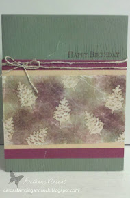
My card for today is woodsy with just a touch of fall. :o) I created the focal point by using a resist technique on white mulberry paper with bavo burgoundy and always artichoke ink. Then for my background, I used a woodgrain stamp which I stamped in versamark ink and then embossed with clear powder for a tone on tone effect. I love the natural look and feel of this card.
Thanks for stopping by!
Bethany
Published with Blogger-droid v1.6.9

Saturday, August 27, 2011

Super Boy!!


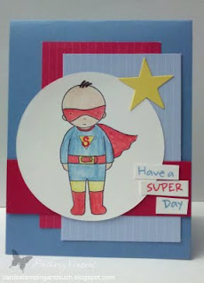
After many weeks, I’m back on the blogosphere. Between moving and the business of summer, I haven’t had any time to sit down at my craft table!! But now that I’m settled into my new space and summer is winding down, I’d like to share the card I made for a special little boy’s 5th birthday. I love the Pure Innocence line of stamps by My Favorite Things and I love this little super hero boy!! I used a rather clean and simple design so that the little boy really stood out, and I went with the classic red and blue color combo: real red, bashful blue, and marina mist. That’s all for today, another post will follow in just a few days so stay tuned :o)

Monday, July 11, 2011

Have a Popcicle

So far this is my all time favorite card design for summer! It isn't original with me, of course; an SU demo named Niki Toll shared the idea as part of a "Summer Fun" class. She credits her upline, Beverlee Morales, with giving her the inspiration. Another thing that makes this a great summer card is the fact that it is quick and easy to create. I start by deciding what size envelope I will be using in order to determine my dimentions. Once you have the card base cut out, you round three of the corners and then use a scallop punch on the fourth to create the "bite." In order to adhere the popcicle stick, I like to use Sticky Strip because its very strong and there's no drying time :o) For this particular card, I chose Lavendar Lace for my base color, and then for the center piece, I wrote "sweet friend" in black marker on Whisper White and "underlined" it with a rainbow of brads (don't they remind you of candy dots?) :)
Stay cool!
Published with Blogger-droid v1.6.9

Saturday, June 25, 2011

Rose Medallion


When Stampin' Up!'s Medallion background stamp first came out, I wasn't sure if I liked it or not. But then I started seeing all kinds of great cards and techniques using it and I loved it!! So when the digi version came out, for only $1, I snatched it right up :o) This particular image is way easy to recolor in a photo editing program, I chose rose red, and I love that you can resize it for your project!! You can't, however use the emboss resist technique, so eventually I will get the real version. But I'm havin' fun with this one right now! After I printed the image out onto pink pirouette cardstock, I added a pearl to the center, paper pierced the bottom edge and stamped "hello" (from the sweet hello set) in rose red as well.
Have a great weekend!

Tuesday, June 21, 2011

Cards for Dads


Happy summer everyone!!! Since we just celebrated Father's Day, I thought it fitting to share two masculine cards with you. The first card is one that I cased from the May/June issue of PaperCrafts magazine. The strips of color are various types of tape guys use: duct tape, electrical tape, painter's tape. I used chipboard letter stickers, thickers by American Crafts, for the word "stuck" and then printed out the other part of the sentiment onto white cardstock.

My second card uses just one image, the new Sail Away stamp by Stampin' Up!. This one is the digi version for MDS and it was only $0.95!! My two favorite things about digi stamps are that you can resize them and that they are so cheap :0) I sponged the background with bashful blue and marina mist to create the sky and sea look, using a piece of scrap paper to create the line and keep the colors from mixing too much. Because this image is such a nice large focal point, all I had to do was add a piece of real red cardstock to set it off from the crumb cake cardstock base and then tie some baker's twine around the bottom! I really like this color combo; its perfect for summer.

Thanks for stopping by and have a spectacular first day of summer!!!

Saturday, June 11, 2011

Just Married


Just a quick post today. With June being such a popular month for weddings, here's a card I made for some friends who just got married. The picture is a sticker that I matted on black card stock. My background is basic grey card stock that I stamped with a flourish stamp from Inkadinkado using Versamark ink. I wrapped a piece of pomegranate, satin ribbon around the center, trimmed the end, and then added a rhinestone brad for just a touch of bling. Simple and elegant.

Friday, June 3, 2011

Celebrate Skateboard


Here's a masqueline card I created recently using some fabulous patterned paper from Cosmo Cricket and some Stampin' Up stamps. The skateboarder is called Extreme Skateboard; I really love these silohette images that SU came out with. Unfortunately they are on the list of stamps set to retire at the end of this month, so I guess I'll have to get on the stick and buy the snowboarder and surfboarder. They really make fabulous cards. I also used a couple screw head brads and the large celebrate stamp from SU's Celebrate Life set. The design of my card comes from a sketch posted by Sweet Sunday - SSSC107. My card base color is old olive and the piece of a circle for my skateboarder is real red.

Now to make a graduation and a father's day card!

Wednesday, May 25, 2011

Fancy Pants Love

Its been a while since I've had time to post any projects, now I'm having a hard time choosing one to share. So I guess I'll start with 3 cards that I created using the beautiful design paper from Fancy Pants called Lilac House (I'm absolutely in love with it!!! :0) The colors and patterns go so well together that I was able to whip these up in no time flat (for me anyway!)


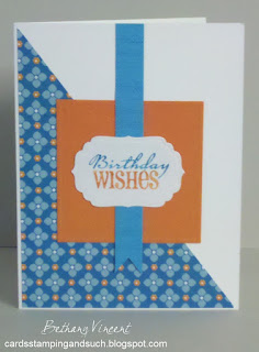
For this card I used a sketch from the Viva La Verve collection - February week 1. For my focal point, I used the berry branch stamp from the La Jourden Boutique set by SU and Antique Linen Distress Ink, but I stamped off once to get a soft background pattern. Then I took the Birthday Wishes stamp from the Sincere Salutations set and stamped it full strength using Vintage Photo Distress Ink. I also sponged around the edge with the Antique Linen for an extra vintage touch.


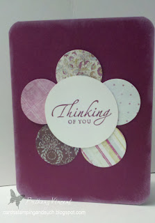
This design is super easy. I used my 1 3/8 circle punch for the "petals" and my circle cutter for the center after stamping my sentiment from the Sincere Salutations set. My background cardstock is SU's rich razzleberry (one of my favorites!) so I used the same color ink for my sentiment. After rounding the corners to carry through the circle theme, I sponged the edges with whisper white pigment ink to match the distressed look of the design paper.


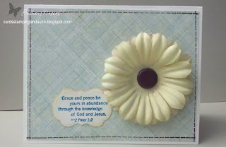
For this last card, I used two of the large flowers from SU's Pretties Kit and sprayed them with glimmer mist from Tattered Angels then attached them with the large chocolate brad. I stamped my sentiment in Taken with Teal on white cardstock and then ran it through my Big Shot using a Spellbinders label die. I lightly sponged the edges with Vintage Linen ink before attaching it to my card front. This is one of my favorite techniques for a vintage look, in case you hadn't noticed :0). Lastly, I used chocolate chip ink and one of the images from SU's In Stiches jumbo wheel, which I unmounted, to create a faux stiched border.

That's it for today. Thanks for stopping by!

Monday, May 9, 2011

Vintage Morning Cup

I'm lovin' this new stamp set! This time I went with a vintage look. My colors are blushing bride, baja breeze, craft, early espresso, and vanilla. The embossing folder is a fun, new purchase from CKC Manchester!! After embossing the paper, I took my antique linen Dye Ink pad and lightly brushed it across the paper to give it an aged look. To frame my images, I used the trusty Top Note die, and then I colored the images using pastels and blender pens. To finish the card off, I added some fun, puckered ribbon and a few buttons. Love the vintage style :o)

Monday, May 2, 2011


In my opinion, one can never own too many coffee/tea stamp sets :D They are all just too cute! These two cards were created using Stampin' Up!'s Morning Cup set. Leanne of weeinklings.blogspot.com created a really cute card that I had been wanting to "case" for a while now, so I finally sat down and created this first card using her design. The color scheme came from an older Color Q color combo (#24) that I really love; its springy but not typical - cameo coral, rich razzleberry, apricot appeal, and baja breeze. For the second card, I used a traditional color scheme of navy, pink and white. This sentiment makes me smile :o) I definitely love me some caffeine in the morning!!

Thursday, April 21, 2011

So Cute - MFT


I have been drooling over the Pure Innocence line of stamps by My Favorite Things for quite a few months, and a few weeks ago I was able to reward myself with the purchase of this totally cute set. Isn't she adorable???!!!! I love how you can stamp her on patterned paper and cut out pieces to make clothes, so fun!! She also works great with markers or chalks. The cardstock is all from Stampin' Up as well as the little flower buttons, both pieces of patterned paper were gifts so I don't know the source, and the border punch is by Fiskars I believe. I'm sure you'll be seeing her again in the near future. :o)
Thanks for stopping by!

Saturday, April 9, 2011

Green Tea Circles


Recently I have been concentrating on using pieces from my scraps drawer, and I found these four circles punched from SU's Green Tree dsp and the smaller circle of Kiwi Kiss paper with "life" from the Celebrate Life stamped on it. Then, for sketch inspiration, I pulled out my trusty Go-To-Sketches issue from Paper Crafts, which I still refer to quite often, and found this layout. My background paper is Baja Breeze, which I find myself using all the time :o), my decorative strip is Not Quite Navy that I punched with a border punch, and lastly, I added a Basic Grey corduroy brad. This is by far my most favorite color combo/style!!
Hope you enjoy :0)

Tuesday, March 29, 2011

Rainbow Twine

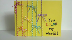
So, my assorted colors of twine from The Twinery came the other day and, of course, I had to play with them right away :) I've seen so many cute cards using baker's twine; it's definately a trend I'm enjoying! Another thing I've seen a lot of recently is rainbows. Its been one of those things where one really catches your eye and then you start seeing them everywhere.
So a few things came together in making this card. And, actually, the sketch/idea came from a card on the front cover of Paper Crafts' special Go-to Sketches issue. After tying each of the colors of twine on the card, I hand-wrote the sentiment using markers. Easy :)
Published with Blogger-droid v1.6.7

Friday, March 18, 2011

Sweet Friday


Happy Friday!
I totally love this ice ceam bowl! Its made using punches which is very handy. I saw this done in a Stampin' Success issue and decided to alter the layout to make it more my own. To create the "topping" I used my scallop edged punch and then punched out a section using one of my circle punches. The banana is a bit tricky; you use an oval punch and then take the oval and punch just a small section of it again with the same oval punch to make a crescent shape. Then just use scissors to round the ends. For the cherry I just used a standard hole punch and trimmed a little piece of olive cardstock for the stem.
Have a sweet weekend!
Published with Blogger-droid v1.6.7

Saturday, March 12, 2011

Rainbow Hi

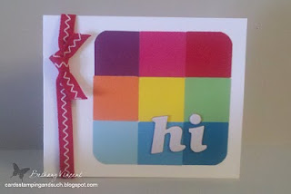
Hello, I have a few cards today to make up for the lag in between posts :0) The other day I was flipping through the latest issue of Paper Crafts magazine looking for something to do with the many colors of squares that have collected in my scraps drawer, and when I saw this card, I died! It's perfect, so bright and happy for this time of year. I had to change mine a little bit; I used the red ribbon instead of two colors of baker's twine and mine says "hi" rather than "baby" but that's pretty much the only difference.


Isn't this little girl the cutest!! She's a digi stamp available on ColorQ, and was created for the fund raiser Mission 4 Macie (you have to scroll down a ways). She is so fun to color cause you can use such bright, fun colors! My colors are celery, rose red, and saffron. The other stamps are from the older SU set Sweet Shapes.


This card is very much based on a sample I found in one of my old issues of Stampin' Success that I had been wanting to copy for some time now. I like how they folded the wrapper to make it look more realistic and give it dimension. The top is cut from felt also for texture and then some glitter was added to the back of a clear button using Crystal Effects for added color and interest. The sentiment is a Verve stamp from the set Big Wish. My colors are confetti white, kraft, and plum.

Thanks for stopping by!

Monday, February 28, 2011

From One to Another


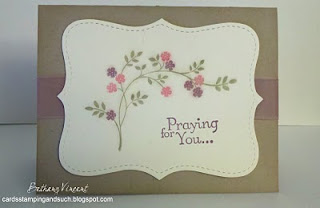
This week I created a sympathy card for a friend using SU's Thoughts and Prayers set and the Top Note die. I love this flower branch image and had wanted to try this soft looking color combo (kraft, vanilla, perfect plum, and regal rose), so I put them together to come up with the first card you see. The layout is similar to one I had been looking to try for a few days, so after I finished the first card and liked the colors so much, I created the next card using the single flower image from SU's Embrace Life set and the sentiment from Sincere Salutations. The kraft layer was embossed with an SU texture plate and a rhinestone brad added to the sentiment for interest. Then this card led me to create the last card pictured because the layout was so easy (love how that works sometimes :0). I used some old colors for this one, purely pomegranate and bermuda bay, and some glitter along with the balloon from Crazy for Cupcakes and a sentiment from For A Friend.

Thanks for stopping by!

Thursday, February 24, 2011

Who's Ready For Summer

Forget spring, who's ready for summer?!!! That was my thought when creating my Aloha card. I used the design paper from SU that was in last summer's mini and coordinates with the Tropical Party stamp set. However, the stamps I used are from a set I picked up in Michael's in their $1 bin. So cute!!! Then I added some saffron ribbon, a felt flower and saffron brad to complete the sketch. These two cards followed the last two sketches for this month's Viva la Verve sketch challenge on Splitcoast Stampers. For the other card, I used a pretty stamp from Verve's Big Wish set that I colored with markers and then stamped to get the two different colors and then die cut the paper to frame the image with a Nestabilities die set from Spellbinders. The nice design paper is from last year's spring line by DCVW. Can't wait to see what next month's sketch challenge will bring :0)

Sunday, February 20, 2011

Throwdown

This weekend I played along with Color Throwdown's challenge (colorthrowdown.blogspot.com). Their combo was Ballet Blue, light green and dark green (CTD129). I used the Embrace Life set for my images and then Verve's Big Wish set for the sentiment. The flowers were colored in using blender pens and pastels, and then I added some Crystal Effects to the central flowers for some dimension. Also, I used some spray ink (Tattered Angels' coffee glimmer mist) on the background cardstock for interest.
Published with Blogger-droid v1.6.7

Friday, February 18, 2011

Digital Valentines


So, this past Thanksgiving I purchased Stampin' Up!'s digital scrapbooking/cardmaking program called My Digital Studio because it was on an amazing sale. And last week I started to play around with the card making part of it; fun stuff! You can put things together so quickly and change things out easily. I love it!! These two cards were designed for Valentine's Day of course, and I decided to email the first card to a bunch of my friends and family. Talk about cost effective!
The background is crumb cake, the heart image is from the Always set, the word stamp is from By Definition, and the embellishments are real red brads and white stitching.
For the pink card, I used pink pirouette for the background and then strips of pretty in pink and regal rose design paper. The hearts are different size punches in basic gray, going gray, and white. The sentiment is one that I typed in myself and using a font called Birthright.
Enjoy your day :0)

Thursday, February 17, 2011

Freestyle

For today's post I have a variety of cards for you. The other day I took a free stamp day for myself, opened up my little drawer that has pieces in it - things I stamped or punched in making a card but then they didn't work for whatever reason on my current project. And these are some of the things I came up with.


Enjoy your day!

Tuesday, February 15, 2011

February Viva la Verve

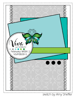
Today I have two cards because I am catching up with this month's Viva la Verve sketches (VLVFEB2011) posted in their forum over on Splitcoast Stampers. Here are the sketches:

and here are my interpretations of them:


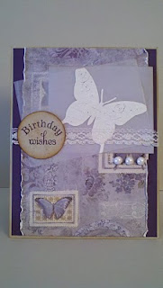
For the first card I used the Cottage Wall collection of dsp, some celery ribbon, and the friend stamp from SU's Simple Friendship set. I embossed the stamp with white powder on pale plum cardstock and then colored in the flowers using my pastels and blender pens. For the second card I went with a vintage look, which is not common for me but I'm trying to get comfortable with it because I like the look so much. I used sahara sand as my base and layered elegant eggplant and a piece of patterned paper that I've had for so long, I don't remember where its from. For my focal point, I stamped the butterfly from the Simple Friendship set in versamark on a piece of vellum and embossed it with white powder. It is layered over a piece of lavender patterned paper from a free pack I received for attending CKC Manchester (woohoo!!). The sentiment is again from the Circular Sayings set from Verve, stamped in elegant eggplant, punched out with a circle punch, and distressed with a sponge and some antique Distress Ink. I then added some lace and pearls to complete the sketch. I'm really happy with the way this one turned out.